Logo Design Fundamentals – The Icon
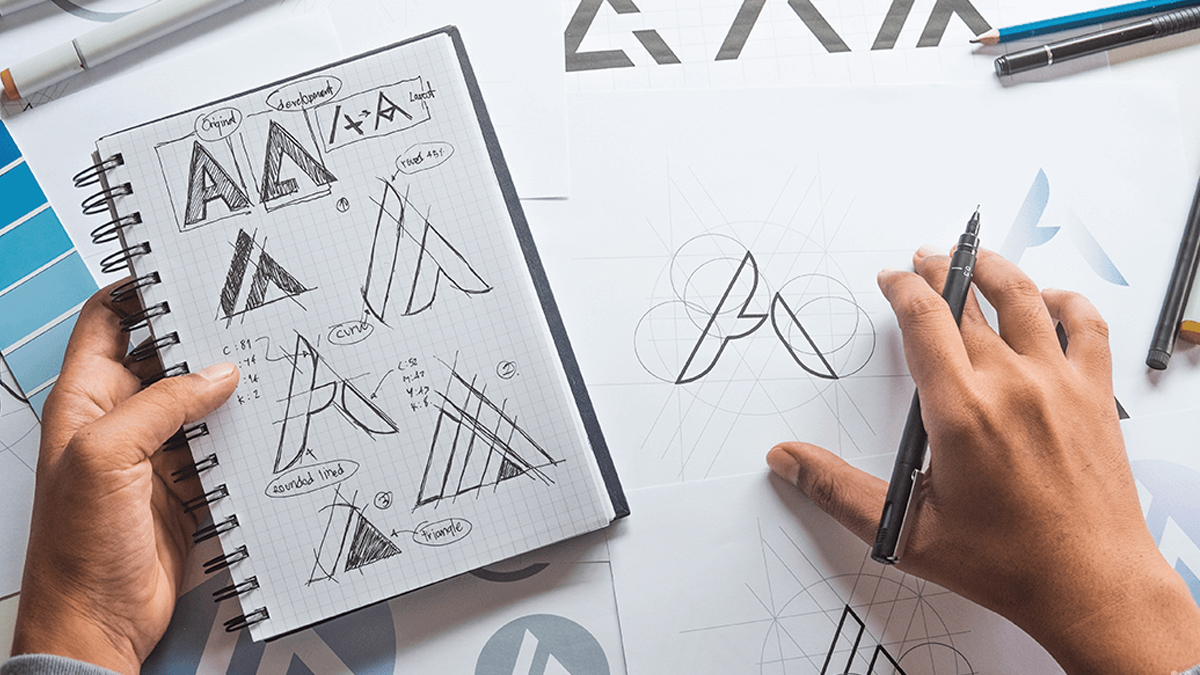
One of the key aspects of a good brand logo is its “mark”. It’s the graphic element in a brands visual identity, but just for simplicity I’ll refer to it as the “icon” throughout this post. Granted there are many brands that do not employ the use of an icon and opt for a purely typographic solution, but by doing so you miss the opportunity to tell more of your brand’s story.
By having a strong, flexible and meaningful icon you’ll give your target market a better impression of who you are, what you do, what you stand for and even a feeling you want them to associate with your brand. These opportunities to tell more of your brand story just through the use of a simple graphic can help create a stronger connection between your brand and your market, and insure more clarity especially when it comes to first impressions. Now ask yourself, why wouldn’t you want that?
The Power of Icons
Some of the world’s most recognizable brands can easily be identified by more people across all nations purely by icon alone, think brands like Apple, Nike & Shell. The power of a simple, bold and clear brand icon creates a message that doesn’t need to rely on language to be recognized and in doing so crosses all boundaries and geographical limitations. In fact, once your brand icon is well recognized and unmistakable to the market, it can become the primary and only use of your brand identity. Just think when is the last time you saw the words Apple or Nike with their respective icons? And Shell have officially stopped using the word Shell with their icon since 1999!
Now I’m not saying you should go and drop the words from your brand logo right this minute, but I do believe that it illustrates the power of an icon in a brand’s image. And how much more effective your brand can be for having one.
Keys to Creating a Great Brand Icon
Now that we’ve established the power that a brand icon can have, what characteristics make a good or even great brand icon? There are a number of factors to consider here;
- Meaning/symbolism
- Relevancy
- Style & form
- Balance
- Colour
- and more…
But if were to state one attribute above all else it would be ‘simplicity’. Yes the old adage of ‘less is more’ has never been truer than in its application to brand logo design. Simplicity is an important key to a strong brand icon, it helps make it easier to read, create more impact, be more flexible in application and ultimately communicate your brand story with better clarity. Adding too many elements and or details to a logo icon is something you should avoid. Especially if those visual elements cause conflicts, clutter and make your logo harder to read. If you are able to tell your brand story or core message using less visual elements then you should do just that.
Distilling your brand logo down to as simple a form as possible without losing your story or core message is ideal. With all the visual stimulus of the modern world thrust upon us daily and in great frequency it becomes critical that you get noticed and fast. If your brand logo and story takes too long to register in the mind then people will simply not remember you.
Here are a few examples of logos that are too busy and or have visual conflicts…
And here are some other good examples of brand simplicity…
Time For a Change?
Now you may be thinking ‘This all sounds good, but my brand logo has worked for me so far. Why should I even consider changing it?’ Well can you absolutely know how your brand is being perceived by its visual identity alone? What if you’re branding has the potential to be profoundly more effective. Should you just do nothing? Many long standing well known brands over time have either changed, updated or simplified their brand logos. Not only is this a result of needing to align their brand image with the times but also in the case of simplifying, create a more engaging, flexible and impactful visual identity that engages more effectively than its preceding version.
Here are a few examples of brands that have simplified their logos…
As you can see each of those brands have removed elements or modified their brand icons to be simpler, clearer and to have more impact.
I hope this gives you some thoughtful insight into good logo design, the power of a brand icon and its effectiveness. It’s a fundamental key to a strong brand that will capture the market, endure and thrive. If you would like me and my team to help you create your awesome brand logo or update your existing one, get in touch with us today. We’ve love to hear your story and create something special for you.
For more on powerful logo design see this post > The 3 Essential Elements to a Powerful Corporate Logo
Please feel free to leave any comments and questions about this topic and have a great day!








 We’re fanatics about culture and impact. Through our client work and our Business for Good initiatives via the GoodNorth community, we strive to create real, positive impact together.
It is not the most appropriate terminology to refer to a visual identity vehicle as an ‘icon’ as this is a term used in semiotics which refers to a graphic device that is representational. Therefore this term may create confusion within this very important conversation. I too steer away from the use of the term ‘logo’ as it is , in my opinion, outmoded. I have for other past decade or so, with in my theory and educational writing and discussions engaged the term VIM (visual identity mark) as every mark generated by an individual, or company or institution is a visual statement of uniqueness and presence.
The use of a typographic device for a VIM can be just as effective, if not more so than some symbol that has been developed because the client wanted something like someone else. The selection of the appropriate type face, well crafted, can be a powerful thing. And completely effective.
I would love to continue this conversation. It is wonderful to find this observation of yours on the net.
Kindest Regards
Jacqueline
Thank you for your comment Jacqueline, I do agree looking at it from a professional perspective as you are too. Although I felt for the majority and those not familiar with the term ‘mark’ it would make more sense to use the more widely used, common terms. Plus for the added SEO benefit. ; )
I too agree typographic devices can be just effective also. Was going to address that side in a separate post later on.
I appreciate your feedback on this. : )
[…] on from our fundamentals post about icons, this one will explore Logotypes. What is a logotype? Simply it is a purely typographic logo, there […]