Why Prudence Rehab had to rebrand
This logo is not their brand
This new logo is more than a bold and brightly coloured icon and typography! Its meaning is awesome, which you’ll learn shortly. It is Prudence Rehab’s brand new logo. But this logo is not their brand.
The common problem that forced this rebrand
18 months ago Prudence Rehab started to recognise a common problem for businesses their size. In their words:
“We had outgrown our brand! It no longer aligned with who we are and where we’re going. We didn’t know exactly how we’d solve it, or what it would end up meaning to us.”
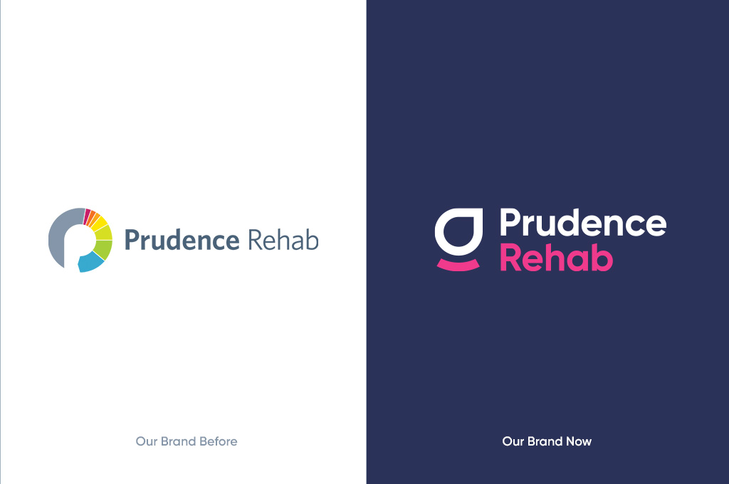
The problem was deeper than they thought
While they felt a rebrand was due, it wasn’t until working with our Sponge team, that they understood the depth of their problem. Their brand identity no longer aligned with where they were heading. Worse yet, their culture code and how they communicated were grossly misrepresenting them in the market.
It was time to get crystal clear on their brand foundations, with a focus on their culture code and how to communicate it. They wanted to ensure sustainable growth and continuing great outcomes for clients.
The way we helped them solve it
They’ve always been practical and inclusive when it comes to strategy. So at their last teamwide strategy day, they focused on culture realignment. With our help they were able to explore who they are, who they want to be, and the positive changes they want for the world.
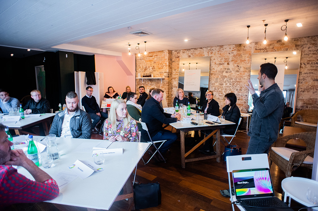
The journey of discovery extended beyond this day. There was work leading up to it and after. We gathered insights from their team, partners, clients and advisors. All this work led to the redefining and articulation of their culture code.
They’ve now got a purpose statement that they love, an impact model that excites them and empowers them to do good in the world, and a values set that guides and unites their team.
With this new clarity it made sense to refresh their brand to embody the newly realigned brand. The rebrand includes a new brand identity, communications framework, and of course, an awesome new website.
Purpose redefined
This was the last element of the brand to fall into place. Defining a purpose statement is hard! And after much reflection and discussion we helped them land on this: Help people get back to their purpose
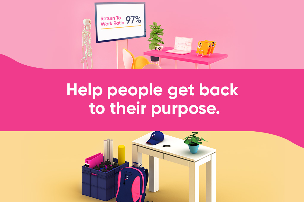
It’s in their DNA to care! So regardless of the relationship, everyone ought to have the right support for what could be the most difficult time in their life.
While the injured person is at the heart of the work they do, employers and insurers equally need the right support where they’re not the experts. It’s why they go above and beyond. And why they are trusted by their clients.
The new purpose beautifully covers the work they do, the way they do it, and their newly defined impact model.
Values and context
With input from their entire team, and our guidance and tools, we have helped them shape five well defined values. The first value, Health at Work, being their guiding principle.
These values are how they intend to show up in the world, what they expect from each other, and what you can expect from them as a client.
As a team they toiled over what each value means to them and were selective about the words used to contextualise them. Here they are:
Health at Work
Optimal health & wellbeing at work is our business and we practice what we preach. We proactively promote this through team initiatives, and by honoring individuality in self care. Holistic health means physical, mental and spiritual well-being, and a healthy work life balance is fundamental for high performance.
Defining Excellence
Going above and beyond is in our DNA. We constantly redefine the gold standard for our industry and ourselves. Our processes and relentless upskilling enable us to continually increase the efficiency and performance our partners rely on us for. We choose quality over quantity every time, maintaining a healthy workload that aligns to our specialties and strengths.
Unquenchable Thirst
We are the leading experts in our fields and strive to stay on the cutting edge. Learning every day, we share knowledge and new ideas and keep an open mind. We listen intently, are hungry for feedback and continuously examine what we do and how we do it, rejecting complacency and always seeking the better way to deliver the highest quality outcomes we seek.
Thriving Team
We make a difference in other’s lives, at work and in the community. We thrive as a team because we are fulfilled as individuals. Like a family, we care deeply about each other, recognising and celebrating our strengths, experience and achievements. Personal and professional goals are nurtured with positive constructive feedback, mentoring and regular peer reviews.
We Own It
Together we work towards a shared purpose. We own our responsibilities, honour our word and trust the same of our teammates. Honest, compassionate and transparent communication is our backbone. We openly share our ideas, thoughts and feelings, owning opportunities to collaborate, and confident our team has our back.
Do Good, Feel Good! Their Impact!
It’s in their DNA as health care professionals to care! As soon as they were able to as a company, they’ve given their team the opportunity to do good in their local communities during paid work hours.
But they didn’t think much about it, other than it being the natural thing to do. As such, they hadn’t formalised it, or thought about measuring the impact they were creating.
Again, guidance from our Sponge team (who live and breathe positive impact), helped define their model. They’ve now committed to quarterly Community Support Days! As a team they spend a day with an organisation who needs help, both as volunteers and as allied health experts.
They cherish their Community Support Days. It’s a way for their team to leverage their energy and allied health skills outside the business to have a positive impact. Clients and team members are invited to nominate a worthy organisation for them to support.
What their new brand identity means
They needed a brand that captured this culture we’d helped shape. It needed to be bold, approachable, and energetic. And it needed to be as distinct as they are.
Brand Mark Rationale
The top shape of the icon represents the injured person embraced with care and returned to work or life, onwards and upwards. It symbolizes the partnership of the team member and the organisation responsible for the injured party.
The cradle element beneath it is the entire Prudence Rehab culture and expertise that supports the journey.
The typeface is the perfect compliment in stance, weight and formation. Bold, vibrant, yet very approachable. It portrays modern service and confidence.
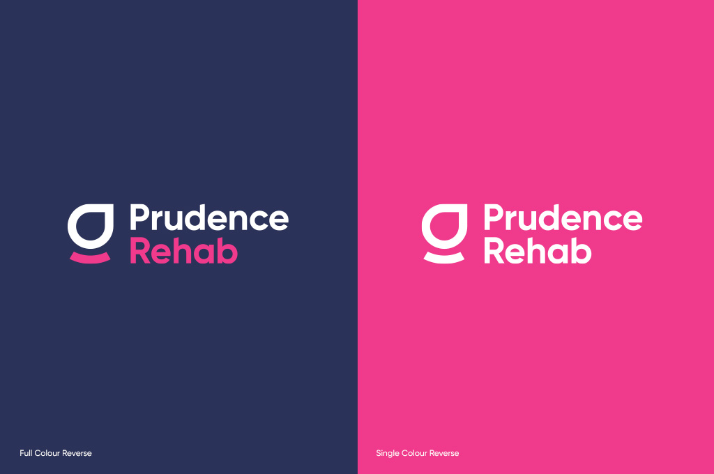
From the different options we proposed, they’ve elected for these colours with meaning. A rich blue that screams the trust that clients place in their expertise. And a vibrant pink that embodies the energy and care they bring to every case.
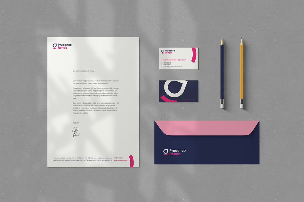
Their brand collateral carries this energy forward. Splashes of colour, lots of air, lots of energy. We want all who encounter it to feel good. Because that is what they are all about.
An arsekicker of a website
Their old website was a bore! It was indistinguishable from their peers, when they are anything but. Naturally that needed to be changed.
It was time to make a statement on par with their brand. Care is in their DNA, regardless of the relationships! And that has to ooze from every word and every pixel of their website. We were up for the challenge!

The images are all 3D rendered scenes that represent aspects of our culture, workspaces and tools we use. Our design team developed a playful style to tell these stories. They are used throughout their new website we built for them, check it out here.
The language they’ve opted for is simple, empathetic and respectful. In writing the copy for the website we’ve left the industry jargon on the cutting room floor and focused on letting you know how they can help.
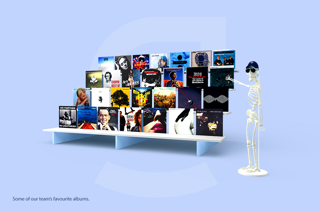
They are fiercely protective of their culture and want to attract those who share their passion for care. Their intention, and our design intent, is for this to be blindingly obvious through the website. We get it! Sponge is culture first too!
In their words
“It’s been an absolute epic journey over the last 12 months working with Luke and his team. We’ve learnt a lot, discovered who we truly are in the eyes of our customers, and now have an amazing brand to be excited about and proudly stand behind. It’s been a game changer for our business!” Rene Becker~, Director
A massive thanks and warm invitation
We’re grateful for the trust that the Prudence Rehab team put in us and our process. It takes time and commitment to the course to do the work.
A big shout out of thanks to each and every team member who shared their perspective and shaped the work. This is your brand. Our hope is that you love it as much as we do.
If you’re in Prudence Rehab’s industry, we invite you to visit their website and join them on our quest to help people get back to their purpose.
If you’re keen to explore how good for the world your brand could be with a similar overhaul. Let’s talk 🙂







 We’re fanatics about culture and impact. Through our client work and our Business for Good initiatives via the GoodNorth community, we strive to create real, positive impact together.