Life Changing Impact: Our Journey with Detour House Inc.
I’ve just turned 16. It’s dark and I’m stepping out of the door of my childhood home, for the last time. I’ve got all the important belongings I can squeeze into my backpack, and I’m feeling overwhelmed by the urgent need to find a new home.
This was one of the toughest periods of my life, and without the help of an organisation that cared about my situation, things may not have worked out.
…
Which is why, when we received an application for our Double the Goodness Grant from an organisation with a mission that resonated deeply with my own youthful experience, it was an easy yes.
Detour House Inc operates two vital services for women and girls at risk of homelessness: Detour House and The Girls Refuge. They were struggling to garner the support they needed, and approached us to help them with a rebrand and a website overhaul.
Understanding Their Unique Audiences First
For any branding or marketing strategy to work, a clear and accurate understanding of the audiences for the brand always comes first. So often this work is not done well enough to brief a design team, let alone develop communications that resonate.
Therefore our journey with Detour House began with a deep dive into their audiences. We guided them through the process of developing real personas, enabling them to truly understand and appeal to their diverse audiences.
For them that meant sponsors, grant bodies, individual donors, the guests they serve, and their internal team. This foundational step was crucial as their existing materials were not effectively addressing the needs of these distinct groups.
Building a Unified Culture
Next, we focused on their culture code, helping them get clear on who they are and how they show up in the world. Having a clear purpose, values with context that guides behaviour, and a unified tone of voice is key for a unified brand voice. They had already begun the work, so we were able to help them refine their efforts with our culture framework.
Communicating Impact Effectively
We then worked on articulating the impact they create. This is often most difficult for organisations deeply involved in doing the work. It is much harder to talk simply about the impact, than to provide the help.
We helped Detour House decide on the metrics that best illustrate the good work they do. And then the messaging needed to communicate their achievements effectively, driving deeper investment from their supporters.
With this developed a clear brand architecture could be articulated.
Refreshing the Brand
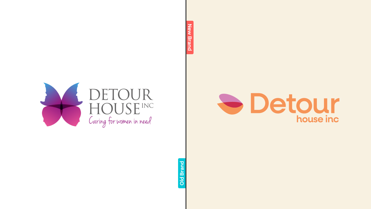
With the foundation laid, we moved on to refreshing the brand. We modernised their colour palette and logo while retaining elements of their previous identity for continuity. The original logo featured a butterfly, symbolising transformation and upliftment.
Our redesign of the icon preserves this symbolism with the hint of a butterfly wing, but also captures in the new design the support and elevation they give to their guests.
Creating a Clear Visual Brand Architecture
Detour House Inc needed a clear brand hierarchy to communicate their services effectively. We developed a brand architecture that reflects the parent organisation, Detour House Inc, and its two services, Detour House and The Girls Refuge. Complementary colour palettes and a cohesive design language now unify their brand, but distinguish the services as independent, appealing to their distinct audiences.
Developing Collateral and Illustrations
Our work extended to developing beautiful stationery, an annual report, and commissioning an illustration style that humanises their impact while protecting the privacy of those they serve. This illustration style carries through to their website and other collateral materials, providing a consistent and compassionate visual identity. Big shout out to Carla Ellis for the illustrations.
Revamping the Website
Finally, we revamped their website. This was a complete overhaul, with a deep user experience rethink, then UI and content strategy for each distinct audience and their needs.
The new design is far easier to navigate, with clear pathways for different audiences, speaking their unique languages at each touchpoint. The site now effectively communicates the problems Detour House solves for each audience, enhancing their reach and support.
A Personal Mission
This project was incredibly personal for me. Having experienced the need for urgent accommodation at a young age, I understand how vital services like those provided by Detour House are, especially for young women and girls.
I encourage everyone to check out Detour House and support their cause in any way possible. The service they provide is more needed today than ever.
A Heartfelt Thank You
I want to extend a huge heartfelt thank you to our clients. By choosing Sponge as your brand and marketing team, you fund our grant and help create real change with us. Thank you, and until next time, be unapologetically awesome.








 We’re fanatics about culture and impact. Through our client work and our Business for Good initiatives via the GoodNorth community, we strive to create real, positive impact together.