The 3 Essential Elements to a Powerful Corporate Logo
Branding Insights #5 – The 3 Essential Elements to a Powerful Corporate Logo
25 years ago (yes, I am showing my age!) as a wide eyed high school boy I became fascinated by advertising and aspired to one day work on creative ideas that would create waves around the world. And while in that time my consciousness has influenced the types of brands and industries that I want to help, I love how an entire business and all that it stands for, can be encapsulated and communicated via a simple, well designed graphic.
I am passionate about branding. I love brands that communicate their story well. I get a kick out of helping businesses find and tell their story through their brand.
Take a look at these corporate logos and answer these three questions:
- What initial feelings do associate with them?
- What story are they telling you about what they do, i.e. product or service, level of quality etc?
- Who are they trying to appeal to?

Now take a look at these logos and ask yourself the same questions.

It’s like chalk and cheese right?
Before you get excited – these brands were all unknown at one point too, they just grew. Did their branding have anything to do with that growth? Well, lets answer that by saying that it didn’t restrict them.
The first set of logos were the result a quick Google image search for logos and simply didn’t meet the criteria set out below. You will be able to identify hundreds more as a result of what you learn here today.
The 3 elements of a timeless corporate logo.
Element 1 – A Sticky Brand Name
A short and sticky brand name is the best because much of the time your brand will be shared purely via spoken word, without any graphic support, so it needs to be unforgettable. Refer to my recent post on the 7 keys to creating a powerful brand name for more on naming.
Element 2 – Brand Mark Design or Logo Design
For maximum flexibility of use across all your marketing material and for scaling without degradation, make sure it is designed as a vector graphic and that it is designed to work in one colour. There is nothing wrong with graphical treatment of a logo for impact on marketing material, however a strong corporate logo will be able to communicate the majority of its brand story without the need for colour. Simplicity is the key.

If using multiple colours, avoid using colours right up against each other as it can create visual discomfort. And to ensure your logo is balanced, carefully consider negative space. A good test for this is to invert the logo, for example a black on white logo inverted to white on black.

If your brand incorporates an icon, which I am a big fan of in most cases, the ideal space the icon should occupy is a square, and it must balance with the logotype. A strong icon is able to represent the brand on its own, so avoid meaningless shapes or graphics that are just eye candy. Think Apple, Red Cross and the Nike swoosh.
![]()
Element 3 – Consistent Brand Usage
Every touchpoint of your brand, be it print, web, packaging or anything else may be a customer’s first impression. Consistent branding means controlling first impressions and telling the right story every time.
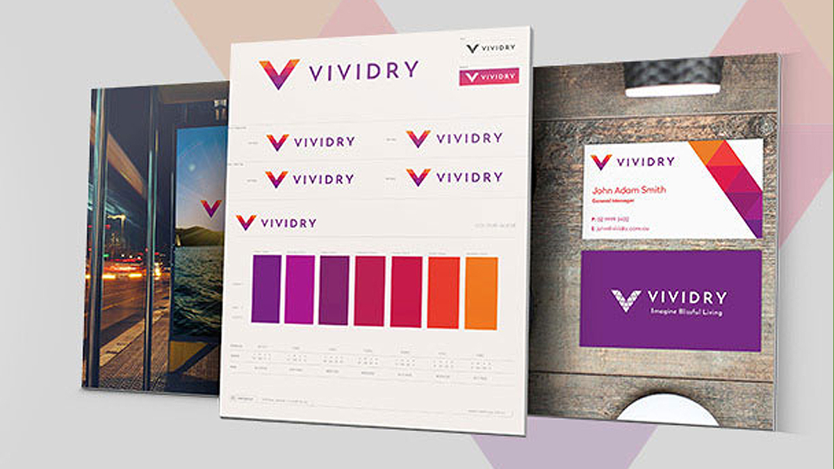
To do this you need to set the visual usage rules for your brand and enforce them with gusto. This is your brand style guide.

Some of the design style guide rules to define are:
- Your logomark and logotype positioning and size ratios – determine how and when to use them together
- Your primary and secondary typefaces – what to use for what purpose and the sizes.
- Your Brand Colour palettes – From Pantones, CMYK and RGB codes, through to Paint and vinyl colour codes.
- Define when and how to use your brand with photographs
- And how to use it on dark, medium and light toned/coloured backgrounds.
Of course there are more, but that will get you started.
Do you have a Compelling Brand Story?
All of what we have just covered is reliant on a rich and relevant story being told by your brand first. Do you have one?
As a starting point – Consider the questions I asked with the examples earlier and then answer this question. How do you get your potential customer thinking all the right things about you?
What’s the Story for The Sponge Logo?
I ask you to think about yours, so it’s only fair to rationalise our logo design and brand name. Why the name? Because for our process of creating story rich branding we soak up all the available information and then squeeze out the gold!

The icon is the simplest graphical representation of a sponge, which we have defined as “an element holding water”. It is bold and simple, our design style. The typeface is custom designed to convey our friendly and approachable nature.
That’s all I have time for today, however I will be posting more on Story Rich Branding soon. We love designing brands as much as I love talking about them, so if you want me and my team to help you create your brand, get in touch today and tell me your story.
Thanks for reading and I invite you to comment with your thoughts and questions below. Have an awesome day!
LF






 We’re fanatics about culture and impact. Through our client work and our Business for Good initiatives via the GoodNorth community, we strive to create real, positive impact together.