How to design a powerful brand
Recently it has come up in conversation that our brand design process is unique to that of our competitors. While we agree that it is a highly successful process, because it is the only way we know, it seems the natural way to work.
To understand what sets The Sponge apart and how time after time we achieve such striking and more importantly effective results, you can simply immerse yourself in the following narrative of our uniquely creative process and imagine how well it will work for you too.
Soaking it up
One of our friendly team meet with you to discuss your goals and objectives, as well as a carefully selected set of questions, focusing special attention on your Vision, Mission & Values. Our first and most important goal is to uncover your core message, or the pieces from which it will be masterfully created. This only comes through a comprehensive understanding of who you are (as an organisation/business) and what you intend to be as a brand. Only those who are prepared to invest the necessary resources, honestly bare all and then trust us to deliver will make the cut.
Each of the key members of our senior creative team is briefed with your answers. We openly discuss them in the first of many forums in preparation for our chilli chicken session (a ritual of brainstorming over spicy Thai cuisine), so that each of us is crystal clear on the objectives. Any questions that arise are asked immediately of you via phone, email, or IM and the answers hungrily devoured.
Studying your competition helps reveals how and where you fit in the marketplace. If it is unclear, then we focus on what you do differently and/or what makes you unique, so as to position you in a space of your own. The team playfully explore “sticky” (memorable) words, or phrases that best communicate your position, to find a core message/positioning statement to build your identity around. The ideas generated here are shared amongst the team and used to fuel for the pre-brainstorm deep dive.
Pre-brainstorm deep dive, or lateral researching, readies the team with many possible design directions. We do this by deep diving in thesaurus, dictionary, quote books, Google search, photo stock, etc. Each new link is laterally explored, following each connection until we hit an end, then we jump back to a fork and follow a different connection until all avenues are exhausted. Every moment an inspired idea is revealed, it is documented or sketched for discussion at the chilli chicken.
Chilli Chicken
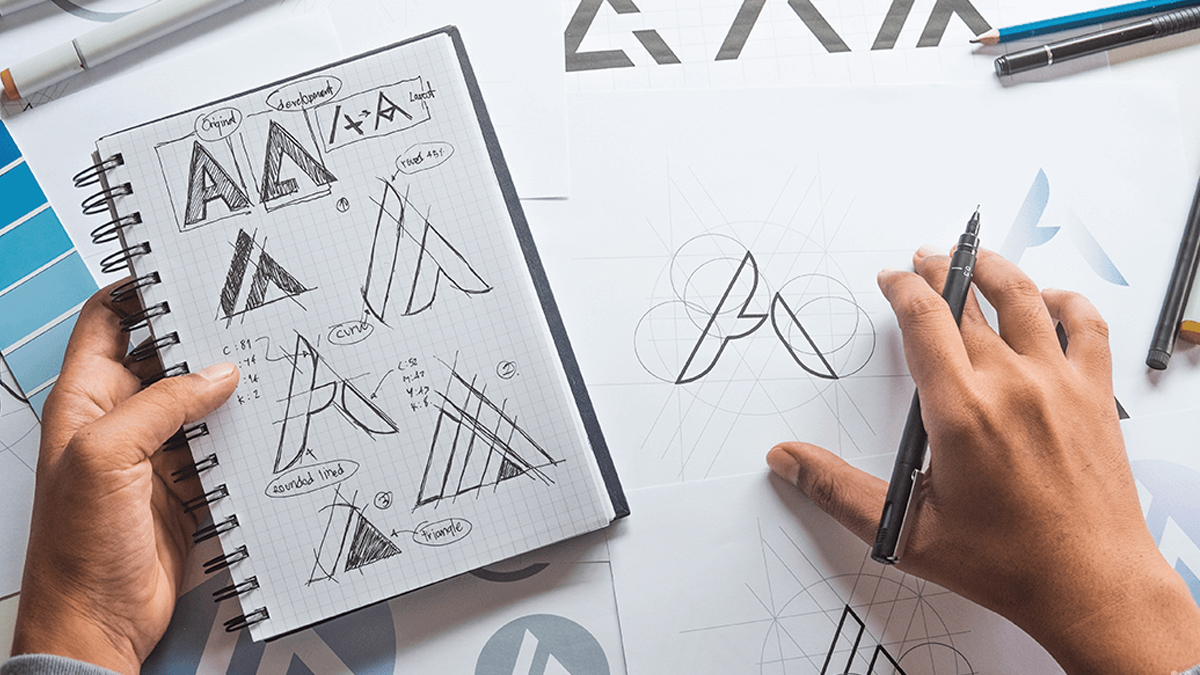
Even if it simply becomes a part of a custom typeface in a logo type, designing the symbol first is our first objective when creating your brand. A huge amount of potential communicating power resides in a strong symbol. We believe in thinking globally for your brand because of global trade and the reach of the internet. A graphic symbol crosses some borders far easier than words, for example we all know the flying kangaroo and we know the golden arches. There are a great many factors that come into consideration when designing an international symbol, i.e. the nationalities and global demographics you are targeting, or hope to target in the future and their social, religious or cultural differences. Another veritable minefield is the international trademark databases and processes that need to be checked and navigated.
An open forum begins where each team member shares their findings from the deep dive and ideas and concepts are voiced. Ideas are quickly sketched with coloured markers onto the largest pieces of bond paper we can organise, the aim is not to create a masterpiece, but simply to convey the core ideas and open up a free flow of creativity. Dozens of ideas are scribbled down, discussed, improved, diversified, contracted, discarded or marked for development. Each idea is continually measured against the core message/positioning statement. Once we have well and truly pushed past the point of exhaustion of directions, as a group we decide which concepts are worthy of being taken to screen.
To Screen
The ideas that were selected are worked up in black and white in illustrator by our skilful designers. It is important to get the design right in one colour first, for its many applications i.e. Engraving and Stamping. It also forces a certain level of simplicity, and enables a brand to own a single colour, something that is common amongst many of the world’s top brands i.e. Coke, IBM. Dozens of versions of each design are explored. Painstaking variations in size, shape, proportion, stroke, etc, are tested, each projecting a subtle change in response. At this stage the concepts undergo further scrutiny as to whether they best communicate what they are intended too and what possible changes may enhance their appeal and concept strength.
From these many refined visual ideas we funnel down once more and select what we as a team consider to be the three most powerful and compelling visual ideas to progress onto typographic application. Careful thought is taken to choose a varied selection of fonts and typographic layouts that compliment the brand’s image and message. With thousands of typefaces to choose from, there are usually a handful that, with a little modification, capture the essence of the brand and compliments the icon well. If a suitable typeface cannot be found, a custom typeface will be designed.
From the assortment of typographic options of each of the final concepts, a further grading is done by the team. This new shortlist of designs conveying different character and strengths are carefully tested for balance by inverting on black so that the negative shapes become the focus. This highlights the balance of the shapes that create the logo, both internally and externally and enables further refinement. The designs that have the opportunity too, are refined further and tested again, and we still haven’t introduced colour yet.
Concept Podium
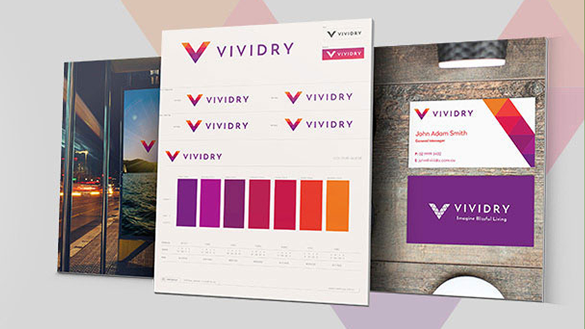
We move those concepts on to the next level of refinement where taking into consideration the tone we believe you need to convey, we explore colour applications and layout many variants and combinations. Each is judged by our team for the emotional and logical response the colour options command. Further suggestions are made and trialled. An official vote is conducted amongst The Sponge team as to which option works best for each of the three final concepts. The final choices are worked up as finished concepts and displayed in our proprietary Concept Podium presentation system. This is where we apply your new potential brand identities to present to you, showcasing them in various applications to give you a feel for each design and demonstrate the flexibility of each concept. The concepts are placed on the Concept Podium in our recommended order of Gold, Silver & Bronze as democratically voted by our team. The Concept Podium also provides a detailed written rationale of each idea and its intent.
We are yet to find a client who has not been exhilarated with our concepts and we challenge you to test our abilities. We love to be challenged and we love understanding new and different businesses.





 We’re fanatics about culture and impact. Through our client work and our Business for Good initiatives via the GoodNorth community, we strive to create real, positive impact together.
[…] Once you have the brand name right, the next step is your brand design. Here are tips for a powerful brand design. […]