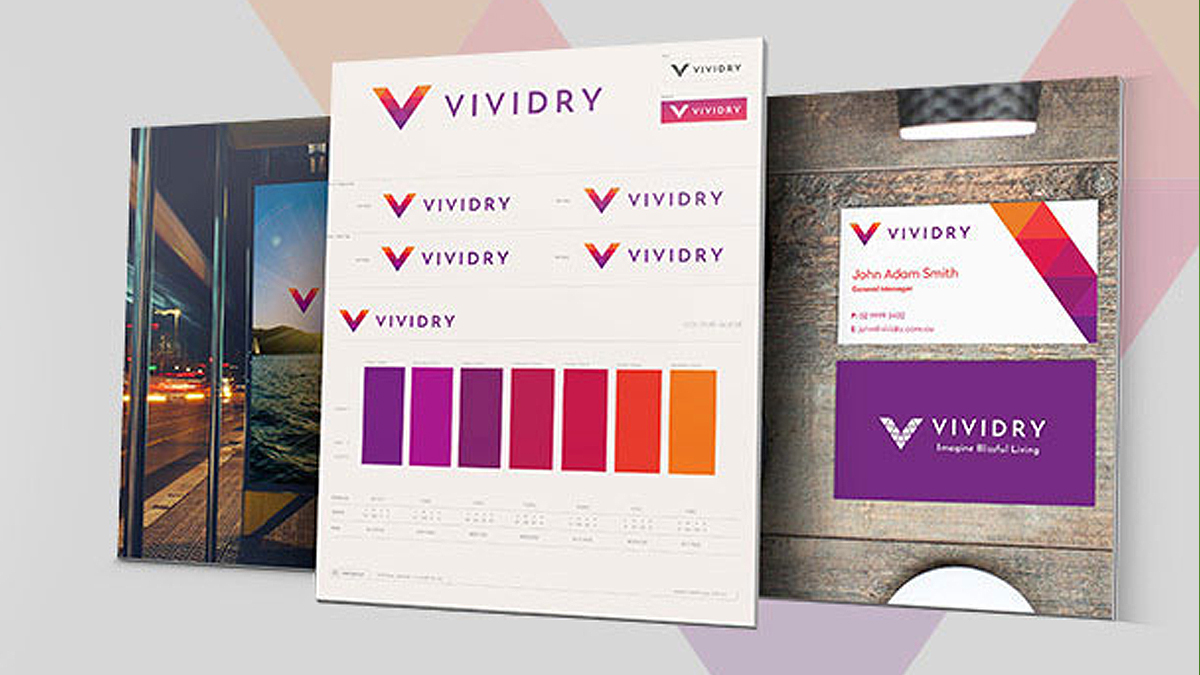
Brand Identity Crisis?
There are common faults that often occur within a brand’s identity as it grows or changes over time. These faults can form a sort of identity crisis and if not identified and addressed can begin to have a detrimental effect on how a brand is perceived. But what am I talking about exactly?
Many brands and particularly young brands trying to establish themselves in their market may initially have a good or catchy name, or story behind their brand. But usually they have a fairly small or specific offering. As they begin to do well and grow they look to expand or branch out their products or services and this is where the trouble can start.
One of the things that often occurs is the name of brand may contain words that directly relate to a specific product or service type and once the brand goes beyond the point of only this offering, then the name isn’t a complete fit for what the brand has now become. Most often the flagship product or service is what the brand has built their reputation on, but if they’re looking to become renowned for more than that one thing, having it feature in the brands name makes it difficult to do so. It limits the brand and how it is perceived in the market. This is why a name ideally should be just that and not a descriptor of an offering.
The meaning and story behind a name can be very important too, it gives your brand a solid foundation that helps serve as a basis for marketing and messaging to your market. If your audience can identify with your story and likes what you are about then it not only will grab their attention, but is the first step in creating brand loyalty. Reinforcing your core story, attitude or values that define your brand in your messaging and across all your touchpoints is key to engaging your market in the right way.
Another area to keep an eye on is consistency, in particular with your brand’s logo/mark. We’ve often seen brands, mainly in the retail or product based markets, use altered or differing versions of their brand mark or logotype. This is generally a bad idea, especially if the style of the different versions conflict with the main position or story of the brand. Some of the reasons this occurs are: a brand has newly introduced a line of products for the opposite sex to their primary one, as part of their growth strategy; Or theming their mark for a specific event; or style relating to a certain demographic; or even range of product.
Although theming for such things can be good to do, it is not something that should be done to the primary logo/mark itself. Graphic additions or elements which accompany, or have the primary mark integrated in them is a better way to go. That way you don’t lose your core identity and muddy the waters in your consumers eyes.
For main points of contact and across all major channels of your brand, you should be completely consistent. Using your brand in it’s primary form will create the stable and strong presence you want which helps build consumer confidence. You have to remember any touchpoint of your brand, be it print material, website, email, product or anything else could very well be the first time someone sees your brand, and if you are not consistent across the board then it can cause confusion if a new prospect sees one brand mark in one place then a different looking one in another.
Common faults of brand consistency can often be, using a handful of different fonts for the brand name on different items, using the mark with type on some items but just the type on others and using a completely different logo graphic to suit a certain style for an event or specific product. Are you guilty of any of these?
If now is the time to revisit your brand strategy, or it’s time for a complete overhaul, get in touch and we will set you up properly so you can grow with confidence.


 We’re fanatics about culture and impact. Through our client work and our Business for Good initiatives via the GoodNorth community, we strive to create real, positive impact together.