
mobile_logovariation
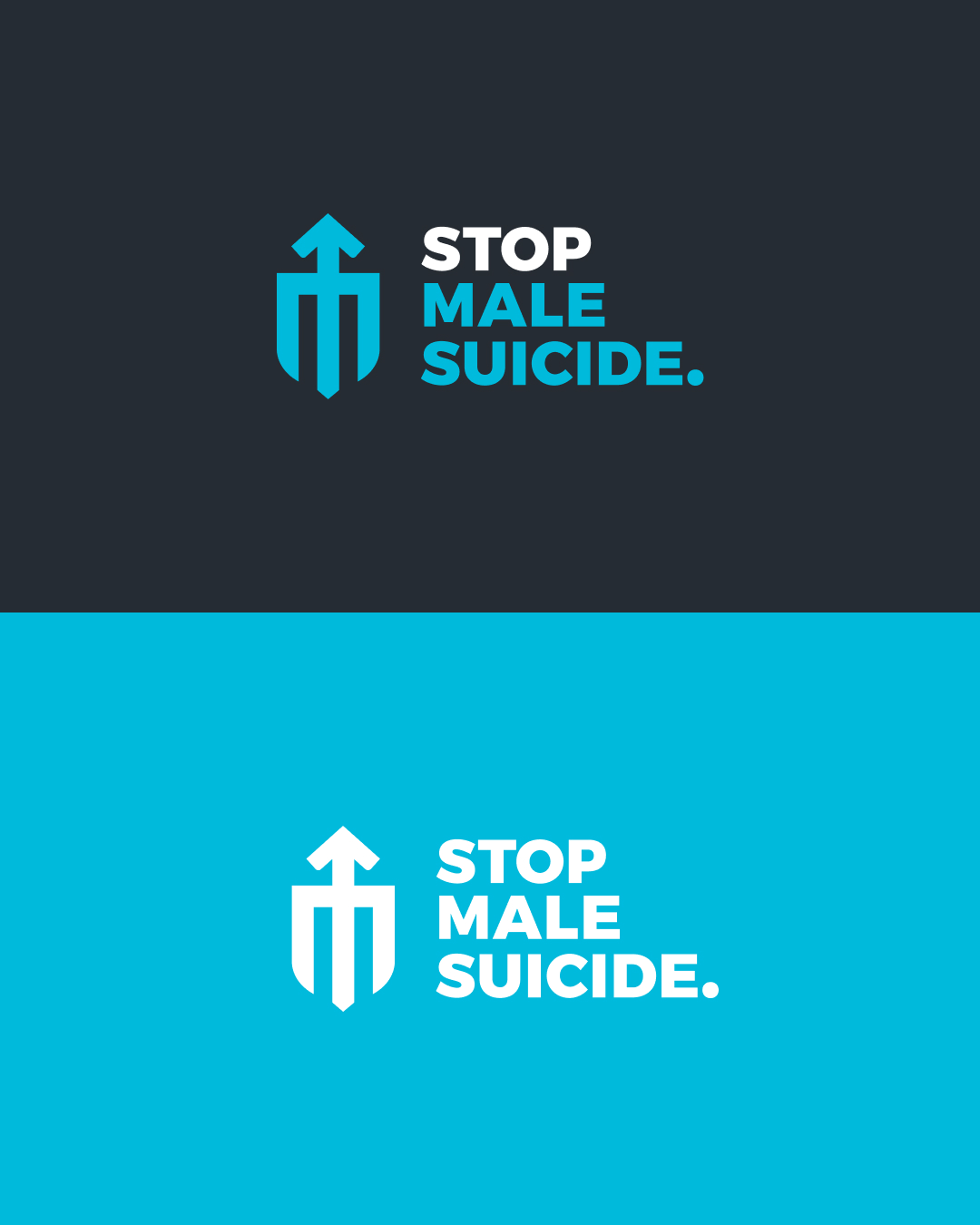
This is a brand refresh. The original design contained a heart and a male symbol, along with the colour blue. These elements spoke of caring for men, and masculinity, but it was lacking.
The new design direction considered the masculine symbol, and combined it with a shield to represent protection, and an M for male. The icon is bold, has strength and shouts that it fights to save men. The blue we choose is dynamic, fresh and masculine.
The name is long, so a bold, all caps word stack works nicely with a tall icon. Emphasis is placed on STOP by using black, and a period adds urgency to the statement.
Related Posts
Where we draw the line
There are moments in business where neutrality stops being a safe or responsible position. Not because the topic is uncomfortable, and not because taking a [read more...]
Why We’ve Chosen Not to Re-Certify B Corp (For Now)
For the past nine years, Sponge has proudly been a certified B Corp. We certified in late 2016, recertified twice, and have passionately spoken about [read more...]
Before You Rebrand: Lessons from Jaguar’s Missed Opportunity
What’s up, good human? Today, we’re diving into Jaguar’s rebrand. On the surface, it seems like a bold move for a storied brand transitioning to [read more...]
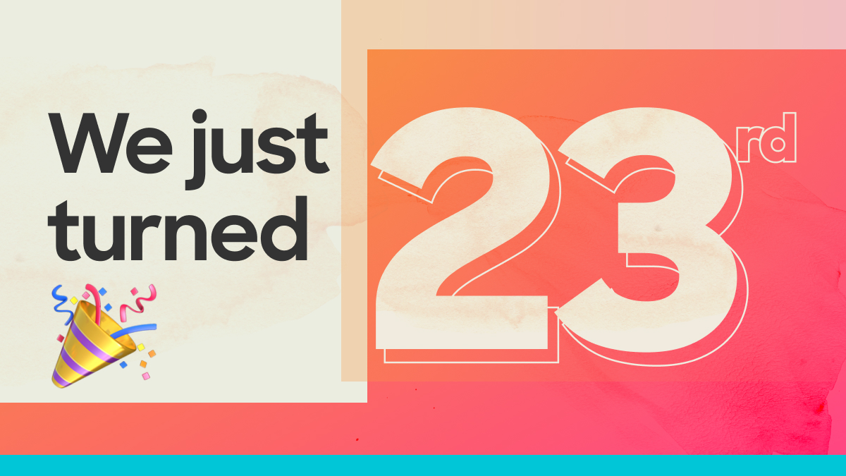
23 Years of Sponge
We turned 23 years old this month. It certainly snuck up on us! And initially it felt like the year blew by without achieving much [read more...]
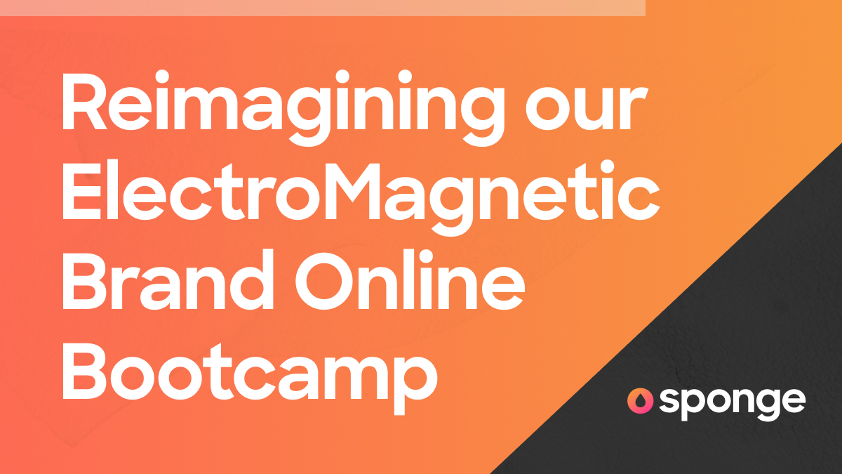
Behind the Scenes: Reimagining Our ElectroMagnetic Brand Bootcamp
What if this year ahead, your brand didn’t just stand out, but effortlessly pulled in all the awesome people you could ever want? That’s the [read more...]
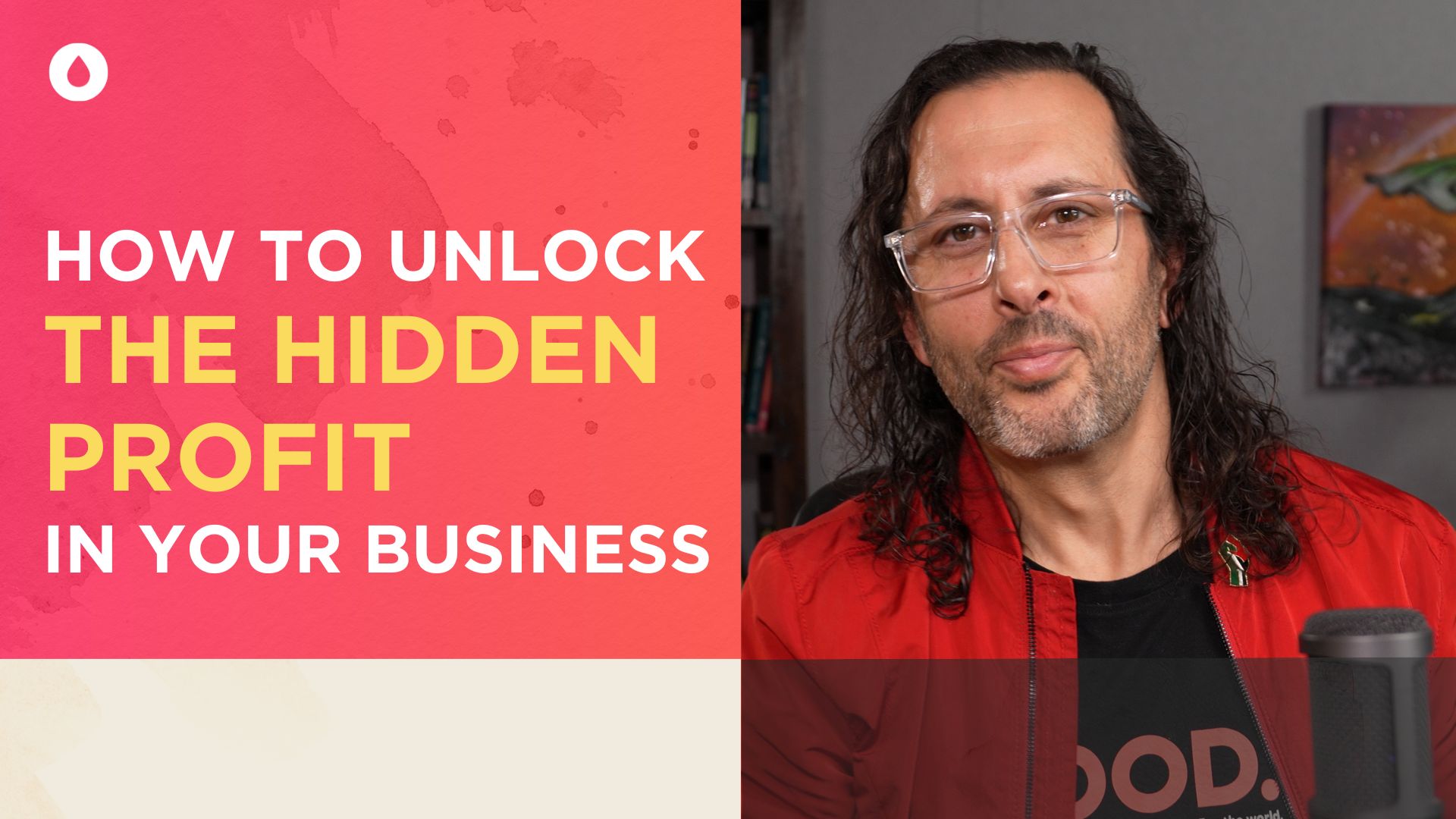
Unlock Your Hidden Profit with One Simple Tool
Struggling with disengaged teams, low productivity, or high turnover? You’re not alone, and it doesn’t have to be this way. With the Profit with Purpose [read more...]
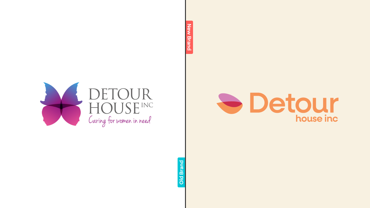
Life Changing Impact: Our Journey with Detour House Inc.
I’ve just turned 16. It’s dark and I’m stepping out of the door of my childhood home, for the last time. I’ve got all the [read more...]
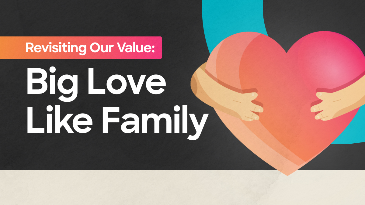
Reconnecting with Our Core Value: Big Love, Like Family
What happens when a culture-first organisation like ours drops the ball on its own values? Or worse, as a culture-focused leader, drops the ball? …it [read more...]
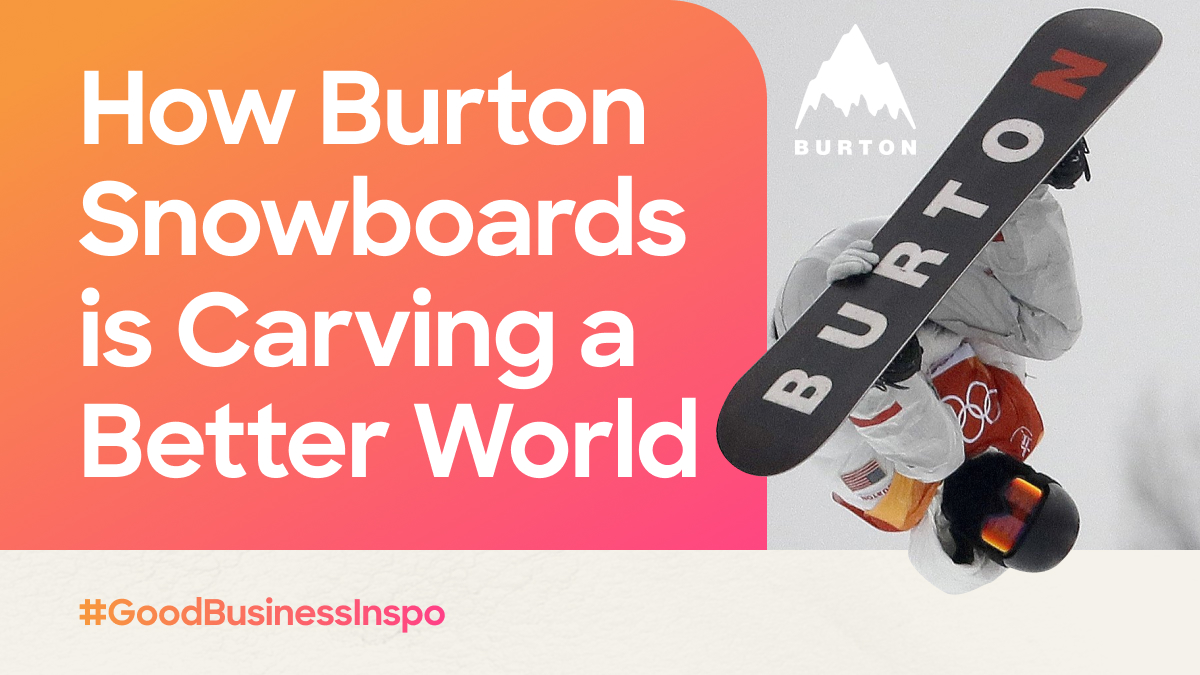
How Burton is Carving a Better World
The Path from Passion to Purpose My journey into the world of entrepreneurship began 16 years before I fully understood the power of business as [read more...]
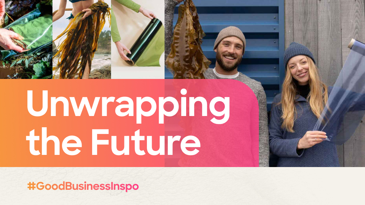
Unwrapping the Future
Sway’s Seaweed Solution to Plastic Pandemonium Hey there, good human! Ever paused to ponder the parade of plastic encasing everything we buy? From your morning [read more...]


 We’re fanatics about culture and impact. Through our client work and our Business for Good initiatives via the GoodNorth community, we strive to create real, positive impact together.