GoodNorth
The Byron to Bundy conscious business and B Local community needed a rename and rebrand to resolve the geographical challenges and confusion caused by the name.


Rename, Brand Strategy, Brand Mark, Brand Collateral, Website, Seasonal Promotions, Pull Up Banners, Digital Advertising, T-Shirt Design
The Byron to Bundy organisation established its name without defining their brand purpose, values, or model! They didn’t talk to the market to get clear on who would be their community members (their customers)! And they didn’t get clear on their impact model, so did none of the foundation work before the name. They were way too eager. And destined for problems.
The main attributes we wanted the new name to embody were:
And of course, be short, memorable, sound good, be easy to say and spell.
For a detailed breakdown of this case for renaming, with all its compelling information, read this post: https://thesponge.com.au/renaming/ripe-for-renaming-byron-to-bundy-renaming-case-study
Here’s why it meets our criteria:
And it is short – two-syllables, so hard to screw up. It is easy to say and easy to spell.
Watch the video here for an overview of what we did for the Byron to Bundy to GoodNorth visual rebrand and how we integrated the key story points.
We brought design elements from the old brand into the new brand making it recognizable:
In addition, we have captured some of the new story in the design:
With this new design, the existing website and social channels are a relatively seamless refresh. It has been designed to be quite flexible to translate easily across the different mediums
Below is the logo presented in primary colour and in reverse. Additionally, there is the brand colour guide where we leave nothing to chance, especially with Orange.
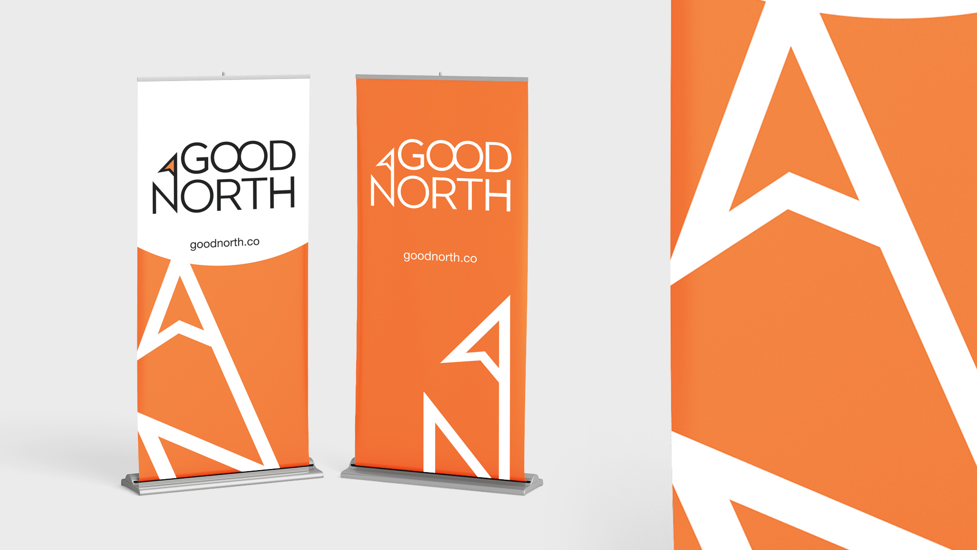
Events are a focus for GoodNorth, so pull up banners are bold, simple and place the logo at eye level to make for great photos.
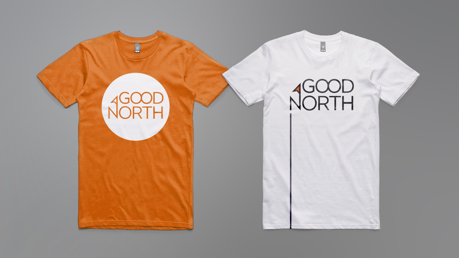
The key to a great t! Bold colour, simple graphics, easily recognizable from across the room and in photos.
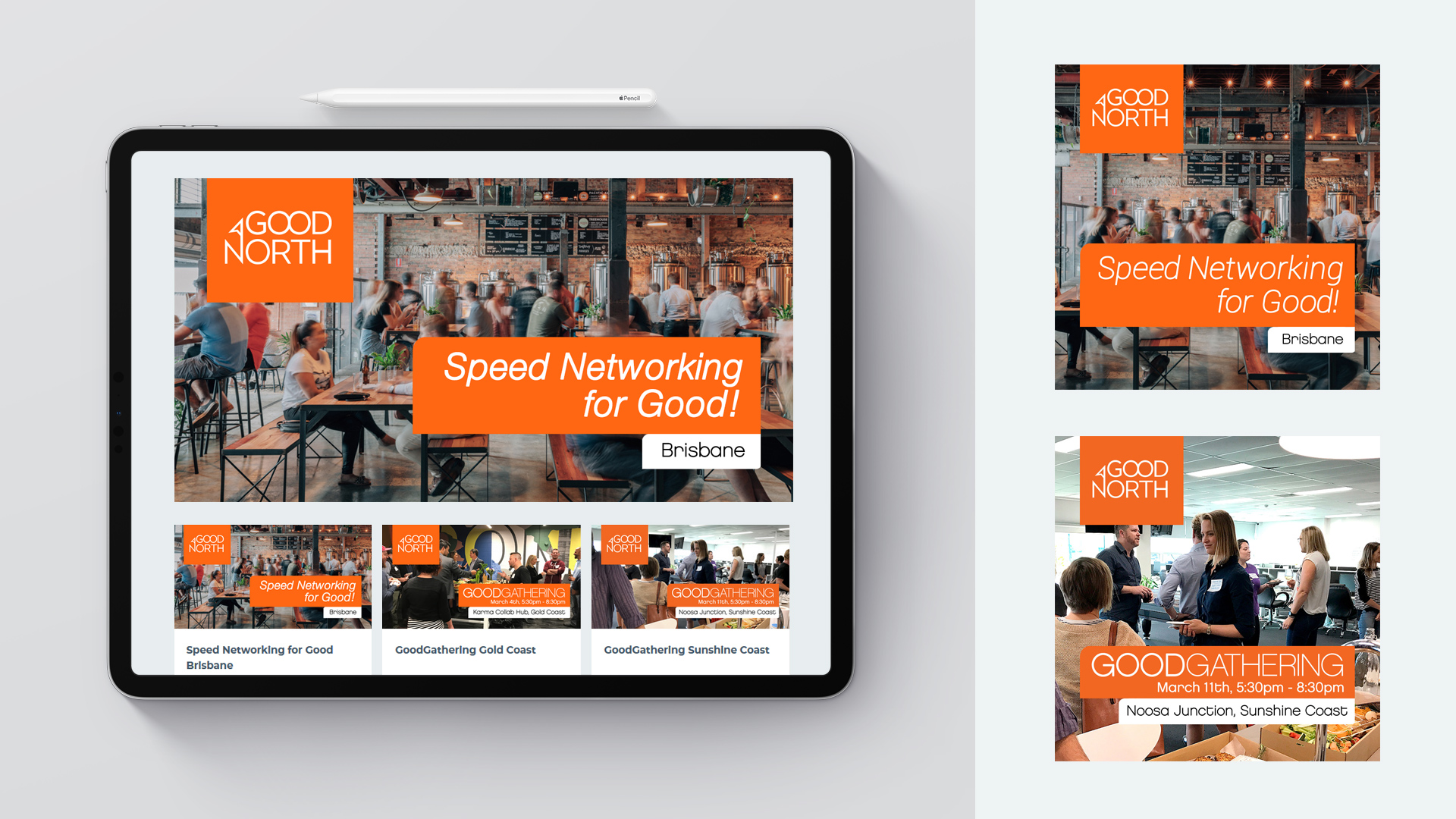
Social media and email communications are the means today to get people to attend, so a design suite to cover Instagram, Facebook, LinkedIn and ticketing sites was required.
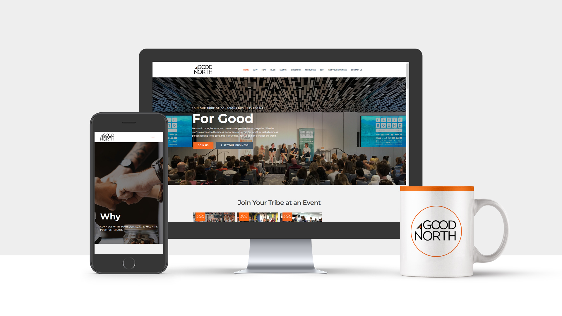
The website had been designed and built by our team prior to the rebrand. With colours and typestyle being kept the same, it was a simple matter of cloning the existing site and migrating to a new domain name. Then the exchange of logos and brand name throughout the site.
Naturally the website is desktop and mobile friendly.
Founded in 2001, Sponge is a branding agency and consultancy led by Luke Faccini. We help purpose-led and purpose-curious business owners with growing teams rebrand and build brands that are good for the world. From brand strategy and naming to rebrands, refreshes, and identity systems, we’ve got you covered.
 We’re fanatics about culture and impact. Through our client work and our Business for Good initiatives via the GoodNorth community, we strive to create real, positive impact together.