
Logo Design Fundamentals – Logotypes
Following on from our fundamentals post about icons, this one will explore Logotypes. What is a logotype? Simply it is a purely typographic logo, there is no use of a graphic icon and heavy emphasis is placed on the brand’s name.
Many brands have adopted this type of brand identity, it is simple and clear but works best when the brand name is short, catchy, relevant or has a strong reputation by name alone. Using a logotype may be simpler visually, but it does often require the market to have prior knowledge of what your brand does or offers. It can also be a bit more limiting in trying to tell your brand story by type alone, but with careful choice of style and implementation of character you can help convey your story well.
Let’s Take a Closer Look
Here are a few examples of brands that convey relevant character and make good use of typography in their logotypes.
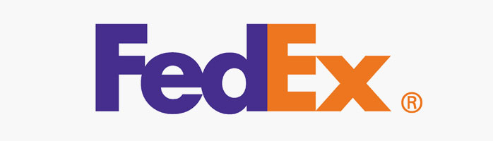 The FedEx logotype is a great example of simplicity and clever use of negative space. The bold san serif font creates strength, authority and a sense of reliability which is what you want from a delivery service. Having the letters tightly tracked to the point of touching enhances the solid strong feel and helps form a tighter visual ratio. And finally the clever use of negative space between the E and the x creates an arrow. This adds character and brand relevancy, such a simple and subtle use of shape but very effective.
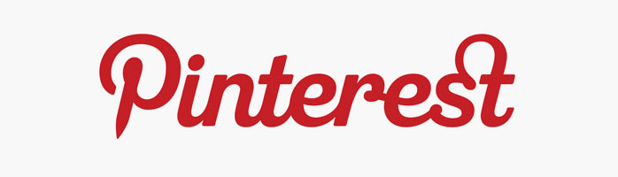
Here Pinterest have used a simple type manipulation in their logotype. The P has been styled to look like a pin, adding relevance and character. The overall type style is in a playful but structured script that flows well together and has good even weight throughout. The only break in the script is between the first two letters and this has enabled the brand to then use the P on it’s own as a icon as well as the full logotype, something all social/web based brands should consider.

Sony with its VAIO product range has gone with a heavily styled approach to type. The almost hieroglyphic looking letters are cleverly shaped to impart relevance and character. The V and A joined as they are form a wave which represents an analog wave, and the I and O are representative of 1 and 0 as in binary code. So there is a transition from left to right of analog to digital. This clever use of letters and form may have been the driving force behind the name choice in this instance.
Adding Character
As you can see there are many ways to impart brand character and story just through typography. As well as some of the more obvious visual cues used in logotypes like letters shaped to form images or symbols other style characteristics can also help to tell the right brand story and add character. Things like…
- Type weight/thickness
- Letter spacing/tracking and kerning
- Font style
- Colour
- Shape subtraction or addition
- Use of negative space
Manipulating all these attributes can create vastly different looks and feels. So the key to making sure your brand logotype tells the right story or conveys the right feeling is relevancy. Taking those style attributes into consideration you’ll be able to make the right first and lasting impression.
Make it Relevant
For instance if your brand was male based or something that’s reliable, tough or powerful, then using heavier weighted or chunky type would best give the right feel, conversely if your brand is more female focused or about fine detail, refinement or elegance then lighter and thinner type with perhaps more air/space around the type would be more appropriate. It all comes down to relevancy, the look should instill the qualities or key themes of the brand.
Lets have a look at a few examples of where the typographic style choices befit their brand.
Strong, Masculine Brands
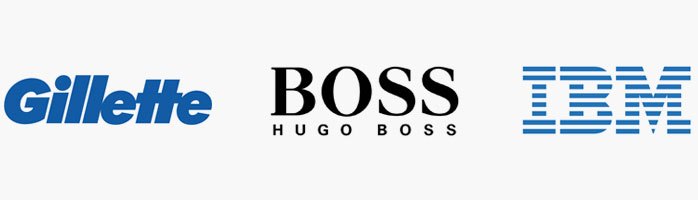
Gillette being a heavily male brand and their biggest focus being shavers and blades, have used a very bold and simple sans serif typeface. This boldness gives a very solid masculine feel and exudes a tough dependable image. Plus the hint of an action feel with use of Italics (the forward slant). It’s a very clean cut no frills typeface that fits the brands market and products well.
Hugo Boss, being a predominantly male brand also has a strong solid look but with use of a serif typeface on the BOSS label it injects a certain level of high class, with the contrast of fine lines and classical serifed edges. Coupled with the bold and clean no-nonsense sub text in sans serif it too has a bold and strong masculine appeal, together fitting it nicely to their class and quality level of their products.
IBM (International Business Machines) a brand that makes and sells robust business hardware that’s reliable, powerful and dependable, creates that presence well with it’s logotype. It’s bold, strong, block like, no fuss hard lines and straight up and down profile certainly create the right impression. It exudes toughness and stability and power. The use of negative space lines break up the simple typeface and give it some character. These lines are representative of many attributes such as speed and dynamism. Set in a blue colour tone that has a very corporate feel, it creates a calm, trustworthy feel.
High Class and Fun Brands
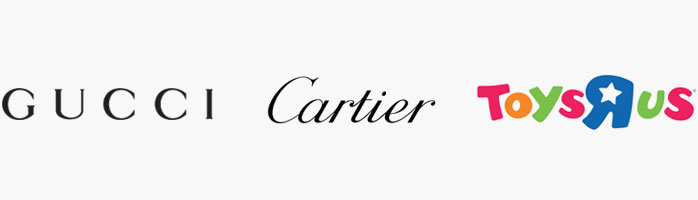
Gucci a high class clothing and accessories brand have a simple yet classical type style. Not too light or bold and it’s slight variances in character curve widths create a good balance of strength and fine style. The wide tracking (space) between the letters give it more air to breathe and help add to the classy feel.
Cartier makers of fine jewellery, accessories and watches adopt a more cursive style with the joining of the letters. The overall weight is quite thin with fines lines giving it an air of elegance and sophistication. Smooth flowing letters set in italic, it almost has the feel of a signature. And with it’s clean cut look it speaks well to both females and males.
Toys R us retail toy store chain makes use of a playful and youthful set of characters. With soft rounded corners, curvy lines and plump solid forms it certainly screams childlike playfulness. Accented by vibrant strong colours and also subtle changes in letter sizing help give it a fun youthful energy. The simple differences of the ‘R’, the size, colour and horizontal flip help create the separation of the words without the need to have extra spacing between them. This is a great example of simple principles and techniques used to create relevant character.
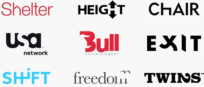
Some Clever Examples
The following are a few examples of typographic designs that have used simple manipulations of space and form to create clever logotypes with relevancy. And show that although simple, they are much more captivating and effective than plain type alone would be.
As you can see logotypes can be very effective in conveying character and telling your brand story. With clever and well thought out manipulations of graphical attributes such as weight, shape, addition, subtraction, colour, space and negative space you can add much more dimension, relevant meaning and story to your brand’s logotype.
Of course a nice short memorable name can help quite a bit. 😉 So for more on that check out our post on brand naming > The Seven Keys to a Powerful Brand Name
As always comments and questions are most welcome, and stay tuned for more. 🙂
Related Posts
Branding and Strategy. Why it pays to pay more.
Brand Positioning and why it is crucial for your business
How to design a powerful brand
How To Use Your New Brand Design To Crush It!
Is It Time For A Brand Change?
Logo Design Fundamentals - Logotypes
Logo Design Fundamentals - The Icon
The 3 Essential Elements to a Powerful Corporate Logo

Brand Identity Crisis?


 We’re fanatics about culture and impact. Through our client work and our Business for Good initiatives via the GoodNorth community, we strive to create real, positive impact together.